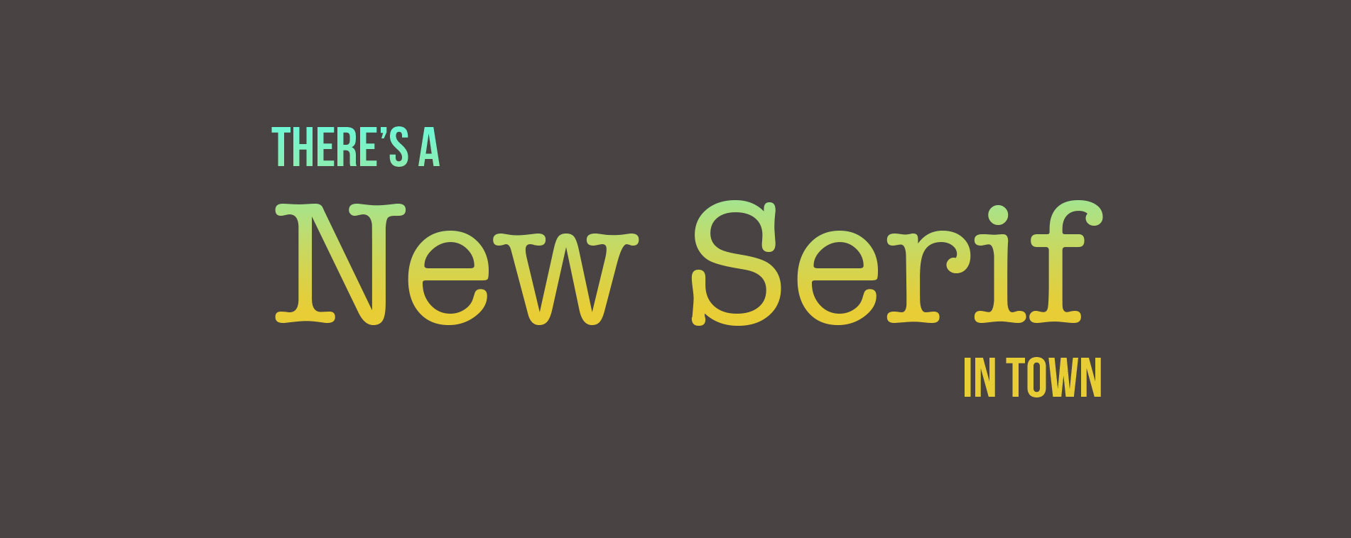
There’s a New Serif in Town
In typography, a serif is the little extra stroke found at the end of main vertical and horizontal strokes of some letterforms. Serifs fall into various groups and can be generally described as hairline (hair), square (slab), or wedge, and they are either bracketed or unbracketed (Typedecon).
The digital age marked the end of the serif font in most peoples’ eyes. It’s hard to believe but Times New Roman died over a decade ago. The former flagship font for word processors met its demise in 2007 in a flood of Helveticas and Calibris. Sans serif fonts have become the standard because they’re easier to read on a screen and generally look “cleaner.” Corporate logos have undergone a shift over the last few years and people have noticed. The shift to a cleaner look is being met with an opposite reaction. Clean design is being interpreted as “soulless.” Now, the “busier” look of the serif font is coming back.
For a company trying to stand out among the emotionless plain of sans serif design can add a touch of personality with a nice, classy serif font. It can serve as a way to draw the viewer in and draw a stark difference between the body copy, which should still be the standard sans-serif. Mixing a serif font into a modern design can give it a touch of class. It can give it a bespoke feeling.
2019 is the year that a style change is primed. Need to spice up your design? Call the serif. It’s ready to jump back into the limelight.

